Friday, 22 December 2017

Study Task 12 - Secondary Motion


I got my sister to record me popping up and ravishing the mango tree in our backyard (she didn't even question it). I then transformed myself into a goat-donkey hybrid. Basically, my spirit animal. I learnt that keeping a rough copy of the moving pieces on the side as reference helps maintain their mass and volume.

What worked well:
  • The ears flopping about really sold the whole chomping-down-on-leaves action
  • The beard made the animation less uniform/symmetrical

What could be improved:
  • The ears are too floppy and uniform, maybe one ear could be slightly raised?
  • The ear motion is a bit too erratic, this could be fixed by making them less floppy too

Study Task 11 - Follow through and Overlapping action


A slightly macabre depiction of the beach, where random boxes sliding on a surfboard come to a sudden stop due to a buried man. I learnt that although some movements aren't very realistic (like the subtle jerk at the end), they help accentuate the overall action. 

What went well:
  • The delay in the motion of the lighter boxes due to weight and friction
  • The little fall of the toolbox at the end 
  • The effect the soft sand has on the level of the surfboard

What could be improved:
  • The centre of mass of the toolbox should change due to its contents moving about, so it should probably fall faster, with less wobble

Study Task 10 - Staging


Here, I created six frames of storyboard for the nursery rhyme, Incy Wincy Spider, depicting the spider as a rock climber traversing a giant spout. In doing this, I learnt that a lot of information can be 'stored' in just six drawings, but in order to make it clearer I might need more.

What went well:
  • Story was easy to follow
  • Character design of the spider
  • The camera movement was easy to visualise
  • Every frame matched up with a line from the nursery rhyme

What could be improved:
  • I could make it clearer by not drawing the same character twice to depict movement
  • I could've used more angled camera shots

Study Task 9 - Anticipation


I wasn't satisfied with just the pull back before the sprint for this, so I went ahead and added a hop, and punch to explore a few more actions. I learnt that the action is actually much shorter than you think, the hold makes it seem much longer than it is.

What went well:
  • The sounds during the holds helped emphasise them further
  • The actions are clear and simple (running and punching)

What could be improved:
  • The holds could be slightly longer
I could also experiment with anticipation for subtler motions. 

Monday, 27 November 2017

Study Task 8 - Squash and Stretch

Animation 1

I wanted to create a ball that wasn't naturally a ball, but was held together with magic or some other force. The vertical motion of the ball was effective, losing energy as it bounced, but the squash and stretch didn't emphasise the liquid 'feel' of the ball. I could've had it ripple slightly.

Animation 2

Rough: 

Final:

I animated the lateral bounce with perspective, to experiment with speed of approach and increase in bounce frequency. The perspective worked well, but I feel I didn't put in enough bounces.

Monday, 20 November 2017

Study Task 7 - Exaggeration

Sound 04


When I heard this my first thought was bubbles. But then I heard a slight echoing in the background hence the second circle within.


Sound 08

This was an abrasive sound, so I put some masses scraping against each other then applied the CC Kaleida effect. Could've been improved with some grainy textures.
After After Effects:

Before After Effects:

Sound 09


I imagined jaws of a machine but the sound was 'soft', so I made it curved lines that glow (on Photoshop).


Sound 10


Made using cel animation, I animated this on twos but the faster bits were animated on ones at 24fps using a dope sheet. 


Sound 12


I visualized a growing, rippling and shrinking mass, which I created using magazine cut-outs. To limit the colours, I used an adjustment layer on Photoshop to keep it a green hue. The motion of the mass could've been improved by distorting it non uniformly.
(Below is the pre-adjustment video)


Study Task 6 - Solid Drawing

Google Drive link to the PDF file


My first few drawings involved trying to build a skeleton/line of action and then adding features.


As I continued sketching, I began focusing on weight, volume and line of action.


In some sketches, I concentrated on the gestures, leaving out the hands and feet.


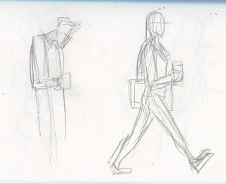
This one (left) was made while I was moving so I had to make my strokes very fast and precise. This meant that the drawings lacked depth - I could've focused on sketching the blocky shapes instead of the gesture.


Wednesday, 1 November 2017

Study Task 5 - Arcs


A wrecking ball swinging without obstruction/collision. It was particularly difficult to anchor the wrecking ball and cable on the crane arm using only a photoshop video layer and so it wobbles slightly but the ball remains in the arc. The fact that the ball is a bit too symmetrical and uniform is slightly unnerving to the eye.

A gif showing my rough poses and more importantly the arcs used. I liked how the animation looped along the y-axis so that's it's clear and comprehensible. At first, the swing wasn't working , I realized that the movement along the arc had to be faster than usual at first to account for the speed gained from free-falling. 

Tuesday, 31 October 2017

Study Task 4 - Easing

Initially for this task, I decided to animate using cell animation, but this proved too time consuming and I couldn't maintain the mass and shape (jittery lines) of the subject I drew which pulled focus away from the easing aspect of it.


I then opted for a more solid, blocky Rubik's Cube, which has moveable parts that can ease too. I found that rotating its faces slightly at first, then rotating it more, creates the illusion of acceleration and vice versa for deceleration. I feel that the sound effects added, although slightly cheesy, emphasise the weight, mass and texture of the cube and work well with the visuals.

Tuesday, 24 October 2017

Study Task 3 - Appeal


I tried making a character without choosing clichés by creating the character's background and personality before choosing any physical characteristics. I wanted this character to be an explorer who experiences some form of restraint that holds back his potential, like a leash.


Here, I experimented with how exaggerated, how cartoony and how mature Gordon is.


   I chose the youngest, cartoony design, since it's the most 'human' one, which is easy to read. The white diamond on his forehead is a sign of intelligence and helps tell him apart from other goats.


The poses describe his character perfectly, however he might need some improvement on his wardrobe, maybe a jacket.
Just like Mickey Mouse's ears, Gordon's whole head is a 2D shape, either looking left or right, since goats have eyes on the sides.

Tuesday, 10 October 2017

Study Task 2 - Straight ahead and Pose to pose


With this animation, I decided to play with the fluidity of masses. How an object can 'gain' mass by adding clay between frames. I also wanted the two poses' colours to be different so that I could transition them by mixing the plasticine. The arm movement worked well, emphasising speed, but the transformation itself wasn't very drastic. Maybe I could've added an extra pair of arms?


Here I took a more complex approach, making use of everything paper cutouts can do; the ability to move pieces between frames or replace pieces with new shapes/colours. Maintaining consistency in the positioning of the cutouts was the most difficult part but I feel the transition was as seamless as I could get it. 


Monday, 9 October 2017

Study Task 1 - Timing


I took a light-hearted approach to this brief with a simple, comical fight-scene. I focused on bending the laws of physics but kept it realistic enough to be believable. I found out that the primary appeal of pixelation comes from it's clunky unnatural motion.


Here are some of the storyboards. The hardest part was to come up with a story that had structure, and characters that had clear motives.


Eventually, this particular storyboard (below) led me on a path to the finished product:


Spinning on top of the frisbee was difficult to pull off, so I improvised and moved the frisbee on top. I also added some comical running inspired by the movie, Home Alone.